The Period Costume Myth: Old Clothes Do Not Make a Past
Period costumes feel convincing when cut, wear, color, and movement belong to a shared world. Learn how clothing gains meaning from its design context.
Why can a character wear a long skirt, waistcoat, or military coat and still look as if they wandered in from another film? Period costume depends on more than old-fashioned shapes: a garment has to make sense beside the people, places, objects, and actions that define the story’s world. Clothing supplies a strong visual clue, but the surrounding design gives that clue meaning.
Clothing Needs Context
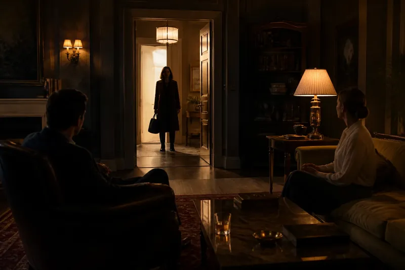
A costume is not a self-contained historical label. Its cut and materials suggest a time, but viewers also read how it fits, how it has been cared for, what the wearer can afford, and how the garment relates to the setting. A polished coat in a dusty room can imply status, care, or a recent arrival; the same coat on every person in that room would erase those distinctions.
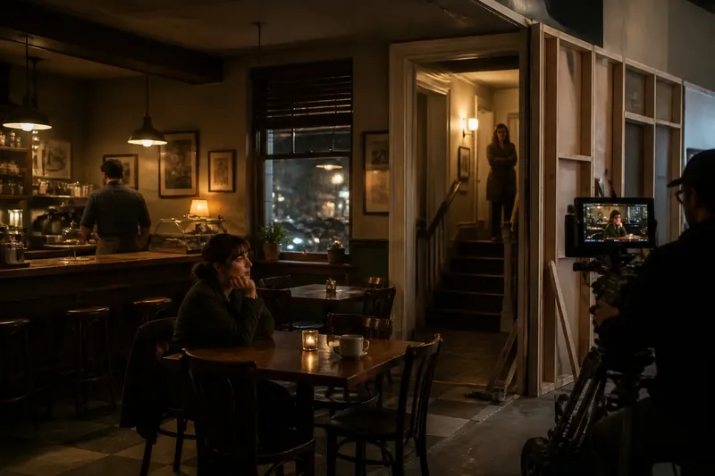
Period design therefore begins with relationships. Costume designers coordinate with production designers, who shape the rooms and locations, and with prop teams, who select the objects characters handle. A sleeve should allow the actor to use a period-appropriate tool. A dress’s color may stand apart from a wall, or deliberately merge with it. Such choices make clothing feel inhabited rather than displayed.
When a costume seems conspicuously “historical,” check what it is doing in the scene, not only what era it resembles.
Silhouette Meets Behavior
Silhouette—the outline a garment makes around the body—can help orient a viewer quickly. But a recognizable outline becomes persuasive only when it fits the character’s movement and circumstances. A stiff formal jacket signals differently on someone standing at a reception than on someone reaching, bending, or working in it. The scene should account for the way the garment behaves.
Movement also exposes the difference between costume as image and costume as lived clothing. A long hem may drag through mud; a fitted cuff may restrict a task; layers may change how a character sits or carries a bag. These details can shape blocking, the planned movement and placement of actors. If the clothing and action contradict each other without purpose, the viewer may notice the costume as an obstacle rather than as part of the character’s life.
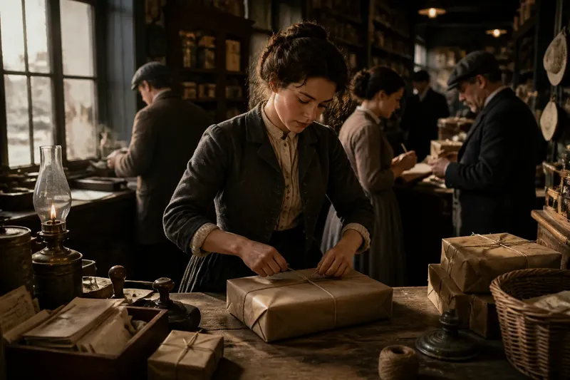
Imagine a fictional scene in which a shop assistant must wrap parcels during a busy morning. If the designer chooses a period-looking jacket with sleeves that fall over the hands, the actor’s work becomes awkward in a distracting way. A more practical cut, perhaps with sleeves held back or naturally fitted, lets the task read clearly while still belonging to the chosen world.
Fabric Carries Social Clues
Fabric communicates through texture, condition, and weight. A smooth, carefully maintained surface can suggest access to time and resources; a softened elbow or repaired seam can suggest repeated use. These are not universal symbols, so the design must establish what they mean in its particular story. A patch may signal thrift in one context and skilled personal care in another.
Costume choices can distinguish people who share the same nominal period. Someone with money may have clothing that holds its shape, while a laborer’s garments may be selected for durability and show the marks of routine. Yet a simple “rich equals fine, poor equals ragged” contrast can flatten characters. A carefully mended coat may express pride, while an immaculate uniform may reflect rules imposed by an employer rather than personal wealth.
Wear is most useful when it has a cause. Ask where a garment rubs, what it is exposed to, and whether the character could maintain it. Scuffing every costume alike produces general age, not a convincing pattern of use.
Color Belongs to the World
Color gains force through its neighbors. A costume’s hue is affected by the room’s paint, the daylight or artificial light, and the colors of nearby objects. A bright red coat might dominate a muted interior, while the same red can become difficult to read against a richly colored wall. The point is not to make every outfit stand out, but to decide how clearly the viewer should read it.
Color can also organize relationships. A family might share a subdued palette without wearing matching clothes; a newcomer might carry a color absent from the household’s rooms. Repetition can connect characters to a place, while contrast can show friction or separation. These patterns work best when they are selective. If every costume carries an obvious symbolic color, the design can feel like a code the audience has been asked to solve.
Lighting changes the appearance of fabric, too. A dark garment can lose detail in a dim interior, while a reflective surface may catch attention at an unintended moment. Costume, set finish, and lighting need to be considered together so a garment remains legible in the scenes where it matters.
Costume And Period Detail?
Does every garment need exact historical accuracy?
Not necessarily. A production may adapt details for clarity, movement, budget, or a deliberate visual approach, but those choices should feel consistent within the story. A few carefully coordinated signals often establish a period more effectively than a collection of isolated historical details.
Why can clean clothing still look convincing?
Cleanliness can fit a character who has the means, time, or role to maintain clothing. The garment still needs to suit its wearer and surroundings, so crisp fabric in a work setting should have a reason rather than appearing untouched by the scene.
How can a costume show social position?
Look at fit, fabric, condition, and access to distinctive pieces, then compare those details across characters. Social position becomes clearer when clothing differences reflect the rules and resources of the story’s community, not just a single costume’s ornament.
What should a viewer notice first?
Notice whether the clothing belongs to the character’s activity and environment before identifying a specific period detail. A garment that supports the scene’s behavior usually feels integrated, even when its historical cues are subtle.
Design Makes Details Agree
A convincing period world does not require every element to be identical in style. It does require the elements to support compatible assumptions. If costumes suggest scarce resources but rooms appear lavishly furnished, the contrast needs an explanation: perhaps the character is visiting someone else’s home, or the setting reflects a different social group. Without such a relationship, the visual information pulls in competing directions.
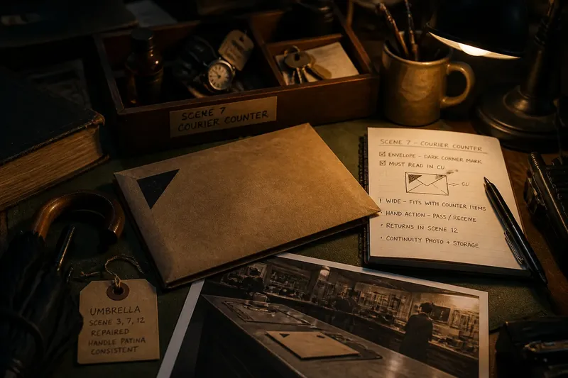
Designers can make these relationships tangible through a shared visual plan. A costume board may place fabric samples beside set colors and reference images; sketches can show how a garment reads against a particular wall or under a scene’s lighting. The purpose is not to lock every choice in place, but to catch conflicts while they are still easy to rethink.
Say a fictional production sets a family scene in a room with faded green walls and polished furniture. The costume designer chooses a dark blue dress for the eldest sibling, then checks the dress against the room’s palette and the character’s movement. If the fabric disappears in the lighting, a lighter trim or different texture could restore the outline without turning the outfit into a bright signal that overwhelms the scene.
The period costume myth is the idea that old-looking clothes can carry an entire past on their own. Period costume feels credible when the garment’s shape, material, color, and wear agree with what the character does and where the story places them. To judge the design, follow a sleeve through an action, compare a fabric with its surroundings, and ask what the garment’s condition implies. Those small observations reveal whether the clothing belongs to a world—or merely resembles one.